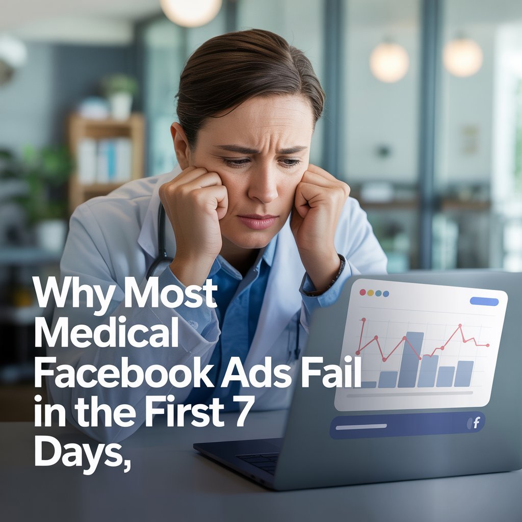
Blog & News
September 2, 2025
Healthcare Marketing
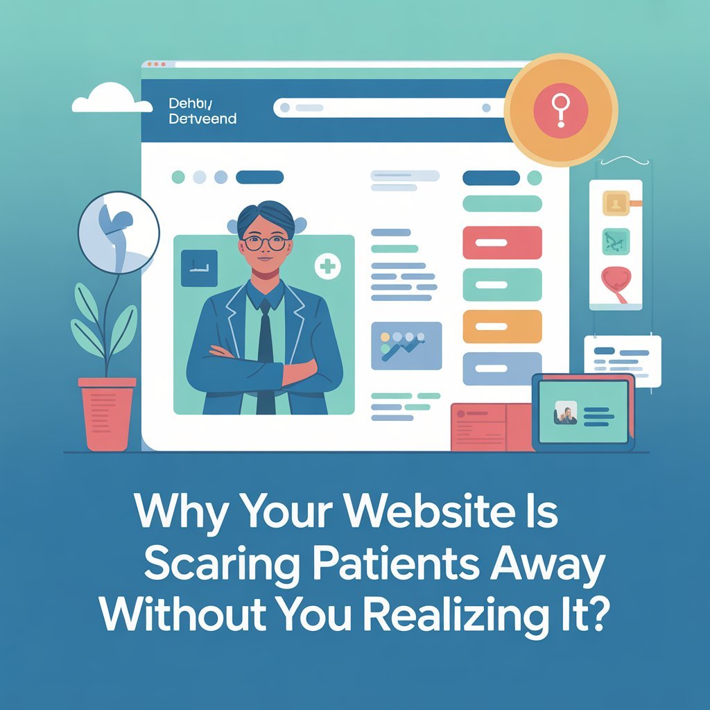
In today’s digital world, your website is often the first impression patients have of your practice. You may think your clean office, years of experience, and exceptional care speak for themselves—but if your website sends the wrong message, patients will never get far enough to experience any of it.
The truth is: a poorly designed or outdated website can quietly scare away dozens (sometimes hundreds) of potential patients every single month. And the worst part? Most doctors don’t even realize it’s happening.
Let’s break down the hidden ways your website may be costing you patients.
If your website takes more than three seconds to load, nearly half of your visitors are already gone. Patients searching for care are stressed, busy, and often making decisions quickly. A laggy website signals one thing: unprofessionalism.
Think about it—if your website can’t keep up, how can a patient trust your clinic to be efficient? Speed isn’t just a tech issue; it’s a perception issue.
Many doctors built their websites years ago and haven’t touched them since. But when a site looks like it belongs in 2010, patients make a snap judgment: “This doctor is behind the times.”
Whether it’s old fonts, clunky navigation, or blurry photos, patients subconsciously connect a dated website with outdated medical care. Even if you’re the most advanced physician in your specialty, your website might be painting the opposite picture.
Doctors often think: “If I show my qualifications in complex medical language, patients will trust me.” Wrong. Patients aren’t looking for a research paper—they’re looking for simple reassurance.
When your site is filled with terms like “evidence-based modalities” or “laparoscopic arthroplasty,” patients feel alienated. Instead, they want to read: “We help you get back on your feet faster, with less pain.”
Clarity builds trust. Jargon builds walls.
Your website should act like your digital front desk. But if patients land on your site and can’t immediately find how to book an appointment, call, or request information, they’ll leave.
It’s shocking how many medical websites bury the phone number at the bottom of the page, or require patients to click through multiple tabs to book. Every extra step kills conversions.
A clear “Book Appointment Now” button should be visible on every page.
Over 70% of patients search for doctors on their phones. If your website isn’t mobile-friendly, you’re done. Pinching, zooming, and struggling to click tiny buttons doesn’t inspire confidence.
A non-responsive site says: “We don’t care about patient convenience.” That’s the last thing you want associated with your brand.
Here’s a hard truth: patients care more about what other patients say than what you say about yourself. If your website doesn’t feature testimonials, Google reviews, or even before-and-after stories, you’re losing a massive trust-building opportunity.
A degree framed on your wall is powerful in your office. Online, it’s a five-star review that seals the deal.
Many practices fill their websites with generic stock images of smiling models in white coats. Patients know these are fake. Instead of building trust, it creates distance.
Show real photos of your office, your staff, and your patients (with permission). Authenticity converts far better than polished fakery.
Imagine if your physical waiting room was dirty, disorganized, and unwelcoming. Would patients stay? Of course not.
Your website is the digital waiting room for your practice. If it feels slow, confusing, outdated, or untrustworthy, patients will quietly leave and book with the doctor down the street—without ever telling you why.
At Marketing Batch, we specialize in building patient-friendly websites designed to convert, not just look pretty. That means:
Your expertise deserves to be showcased properly. Let’s make sure your website becomes your best-performing marketing tool, not your silent patient-repellent.
Marketing Batch is a full-service digital marketing agency helping healthcare practices, real estate companies, and startups grow online. From SEO and social media to web design and paid ads — we deliver strategies that boost visibility, build trust, and drive real results.